Our new look is s**t hot, there’s no denying it. Here’s what Penquin’s Panda has to say about his new crib, new website and re-ignited passion for creativity with a purpose.
On the 29th June 2018, we unveiled our new look and feel, live on social media. For those of you who missed out (sorry for you), here’s your chance to get to take a look at the awesomeness which is the new Penquin. There’s nothing subtle or delicate about our new look - and we couldn’t possibly be more excited about that. Just like our people, Penquin’s new corporate identity (CI) is bold, strong and filled with a whole lot of soul.
Introducing Penquin’s new look and CI

I was lucky enough to catch up with some of the Penquin team this week and find out how my house warming came about. First I chatted to Veronica Wainstein, our MD, here’s what she had to say:
Why did Penquin need a new CI?
“Penquin has been through so many changes over the past few years. We restructured the business, our leadership team changed and so did our ownership, we implemented new processes and then restructured again. It’s been wild.
After all these changes, it didn’t feel like we had a single minded focus.
I wanted to make sure that we were giving our customers exactly what they need and want from us. Customers are the lifeblood of our business, everything we do is for them because they’re why we exist. This was the main objective with our new communication strategy - solidifying our customers at the heart of what we do. We’ve always had a strong customer focus, but now it’s entrenched in our identity as a brand.
Our new communication strategy is also designed to showcase the heart and soul of Penquin - our wonderful team. We’re not just any old agency, we are fun to work with, have bold ideas and are not afraid to challenge the norm.
After doing the communication strategy, it became clear that we needed a new look to align with our business goals and bring it all together.
The new look is also the beginning of a new era for Penquin - it reflects our vision. It’s strong, passionate and vibrant, like our team. We’ve honed our focus as a creative agency. Our new look is on trend, pushing boundaries to give our clients confidence, knowing that we practice what we preach. We’re not afraid to be disruptive and try new things - our brand is our playground to let our creativity run wild.”
I asked Veronica, or as I call her, Vee, what she thought of the end result, and her answer was short and sweet:
“I dig it!”
Penquin’s evolution as a brand - nearly two decades of advertising excellence
- Penquin logo 2000
.png?width=300&name=1%20(2).png)
- Penquin logo 2002

- Penquin logo 2008

- Penquin logo 2011

- Penquin logo 2018

Be awesome or die trying… Penquin’s CI concept
Next I caught up with Danieka De Bruyn, our Mid-level Graphic Designer and one of the drivers of the new design. She’s worked with David Doubell, our Executive Creative Director to find out how Penquin’s creative team conceptualised our new look. Here’s what she had to say:
“We looked at the logo and old CI, it didn’t really scream ‘agency’ - it was a bit outdated. Studio felt we needed a shit hot new look to bring Penquin into 2018.
We did very in depth research and lots of brainstorming sessions to determine trends and see what the most creative agencies in the world are doing. We wanted the new CI to be filled with movement and motion - symbolic of the fast pace of modern society and technology. Everything is moving at the speed of light, and that’s where Penquin as a business is going. We want to be the top creative agency with disruptive ideas, pushing boundaries and at the forefront of change.”

The new CI concept
What I love about the new CI is not just the look and feel, but how clever it is. Danieka explains:
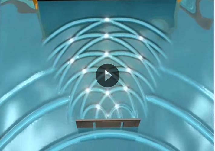
“One of the great mysteries of the universe is quantum physics, and this concept inspired me hugely in the new CI design because in many ways it represents the rapidly evolving nature of agency work. I presented the double slit experiment (watch the video below) to the design team in our studio play time session, in which scientists show that light particles act as both dots and lines.
This concept was the start of the new CI, because everything begins and ends with a dot. Whether it’s a pen on paper or a full stop, dots are integral to the creative process, and we integrated dots - represented as circles - into our logo (as you can see, the P is always in a circle). we also integrated lines into our design, with squiggles and straight lines representing the creative process .
I didn’t anticipate quantum physics being the inspiration for the new CI, but it just goes to show that you can get inspiration from anything.
The new CI is bold and strong - there’s nothing delicate about it. A dot can become anything - the minute you put pen to paper, you make a dot and then it evolves into words, ideas, designs - anything you can imagine.
As you’ll see, the CI has lots of colours, patterns and layers - these reflect the waves of interference but also the soul of Penquin: our CI is a living, breathing thing which is constantly moving, evolving, becoming better. Studio has challenged the Penquin team to play with the CI, and to see what they can create, and don’t limit yourselves. The lines in the CI are smoother, less angular, with more flow - indicative of motion, space for growth and development.”
We’re excited for what’s still to come - the team told me there’s lot’s still rolling out. Watch this space!
Subscribe to our blog and we'll keep you updated with everything that's new.


SUBMIT YOUR COMMENT